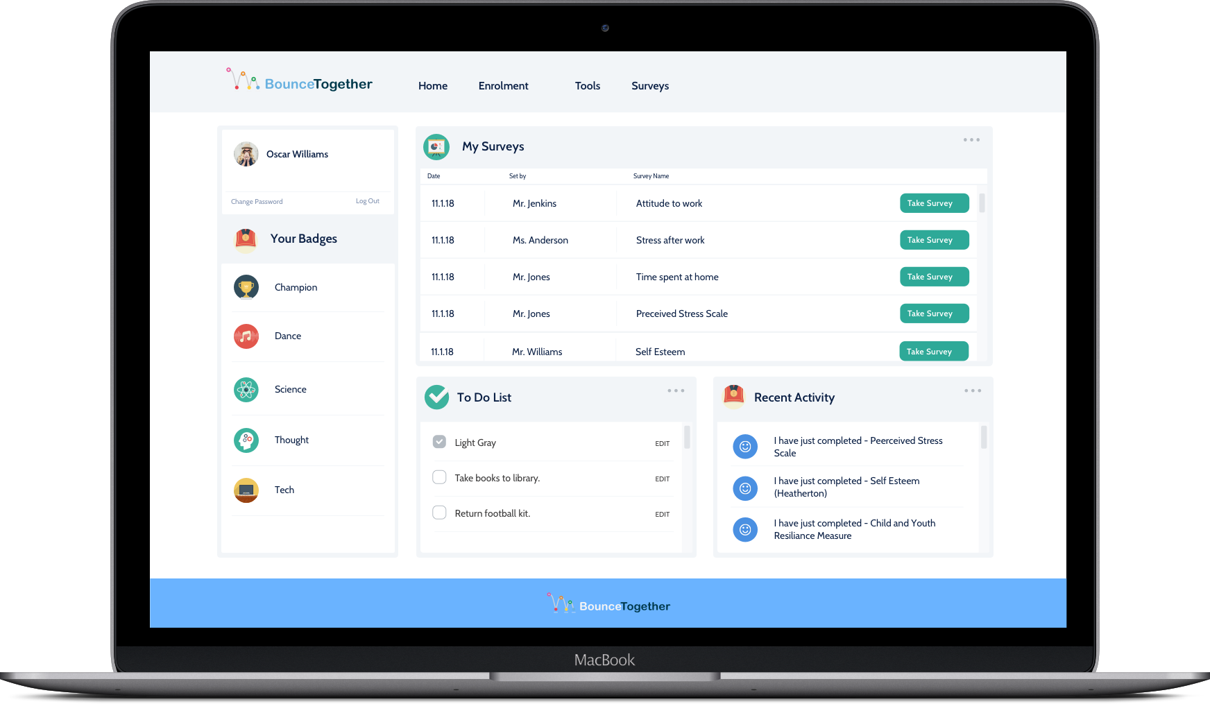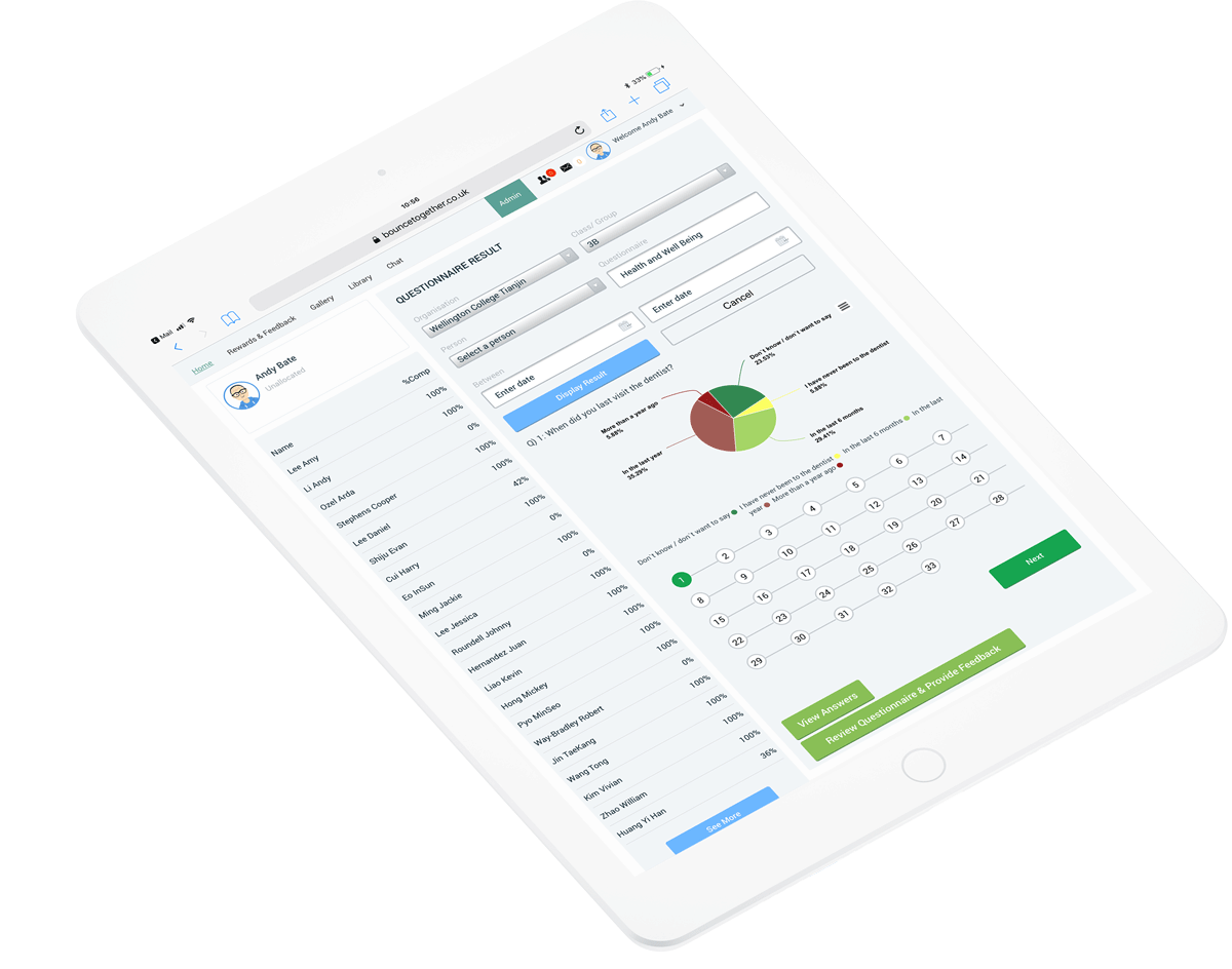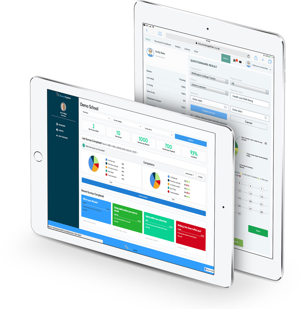
Bounce Together is a new start up looking to evidence issues such as mental health, wellbeing, behaviour and health/physical activity in schools. It was looking to create a new brand for the business and a website which quite simply portrayed the simplicity and ease for schools in collecting data from their school children.
From speaking with the team behind Bounce Together, it became clear early on that they wanted a vibrant, dynamic brand which connected with educators and school children alike. The brand needed to convey a modern look and feel, portraying Bounce Together's modern approach to evidencing data.


Due to the fact the business was in its fledgling stages, content was relatively sparse - so we needed a site which allowed for the existing content to be displayed elegantly, but also allow the Bounce Together team to be able to add and grow to the site as they needed.
Very modular wireframes were created to display the display the structure of the site, and we then dived straight in utilising the brand colours and icons we created for the business.


We were asked to design a dashboard for their clients to interact with the data and questionnaires they had created. Using Sketch and Webflow we managed to create a working prototype which allowed the client to see an actual User Experience and get a feel for how the Dashboard would operate.